Table of Contents
1. Introduction
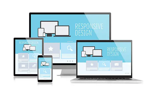
Responsive Web Design (RWD) is an approach that ensures web pages render well on a variety of devices and window sizes. It combines flexible grids, layouts, and images to create a seamless user experience across devices...
2. Principles of Responsive Design
The core principles of responsive design include fluid grids, flexible images, and media queries. These elements work together to adjust the layout and content based on the user's screen size and orientation...
3. Techniques for Implementation
Techniques for implementing responsive design include using CSS media queries to apply different styles based on screen characteristics, employing percentage-based widths for elements, and using responsive images that adapt to various resolutions...
4. Tools for Responsive Design
Various tools can assist in creating responsive designs, such as CSS frameworks like Bootstrap and Foundation, which provide pre-built responsive components, as well as design tools like Figma and Adobe XD for prototyping...
5. Challenges in Responsive Design
Challenges in responsive design include ensuring performance on mobile devices, maintaining consistent design across platforms, and handling complex layouts. Addressing these challenges requires thorough testing and optimization...
6. Conclusion
Responsive Web Design is essential in today’s multi-device landscape. By embracing its principles and techniques, developers can create websites that provide an optimal user experience, regardless of the device being used...